Today, I want to discuss small business lead generation. And, even more than that, by the end of this article, you will be able to turn elements of your website around for better lead generation, leading to more customers and more sales.
Tell me if this might be anything like yourself, or another small business owner with a website, ok? You spend a nice amount of money on a beautiful website design. The digital marketing agency you hire has built content, and a great social media following. However, everyone omitted small business lead generation.
So now, you get a few hundred visitors a month on your business website just from organic search alone. But, where are the calls? Where are the emails asking for help???
Sound like you?
You’re wondering about conversions, right? You are wondering, ‘WHERE ARE MY LEADS?!?!’
You see a thousand or two people come through your website, however no one is calling…no one is writing…
Nobody…
Why?!?
Most likely because your website just wasn’t built with business lead generation as a focus. Leads are qualified people who come into your website and contact you. With a website focused on lead generation, the traffic is qualified and you make lots of it. Depending on their landing page, you direct their action.
The formula is simple…
Leads = qualified visitors + interested traffic + performs qualifying action
Before you decide to do what some business owners do as in buy leads, or rent leads, why not own your leads?
I’d like to cover three simple pieces of proper lead generation in a website. If you are in an industry where emergency or 24-hour services are provided, this could also boost your income by 100% or more in the next month. Even if you not, making these three changes could yield more calls and emails than you’ve experienced in the past.
Before we start, you need to understand…
I want to be honest with you.
Most small business websites are not designed with conversions in mind. Most layouts are generic, and they DO NOT make it easy for the end user, that new, shiny lead to quickly become a paying customer. Other websites that do have a decent amount of capital invested in them, are done for beauty sake, and not with a focus on sales.
Pick one of the following, any one of the following, scenarios that could happen to a customer:
- The furnace is on the crapper and just won’t work
- The drains are backed up, and we need help
- The fuse box just flaked out and won’t switch on
- A branch fell and cracked your windshield
- We came out of the store, and our car keys are inside the car
- Our hot water tank just blew up
Ok, so take ANY of these scenarios, and in 2016, what do you do?
“What do you do? WHAT DO YOU DO?!?”
Sorry for the ‘Speed’ flashback. But, in all seriousness, what do you do?
In 2016, for the majority of people in the United States, you whip out your phone and run a search for:
- furnace repair
- clogged drains
- electrician help
- windshield repair
- keys locked in car/locksmith
- plumber
Google, the biggest search engine in the United States, then gives you results based on your location, relevance and prominence. These are three attributes that are used by the search engine to give the best results for local searches.
If you run a search for ‘plumber’ while you are in Pittsburgh, you will see plumbers that have service areas around Pittsburgh. If you need windshield repair or glass repair and you are in Philly, you will see glass repair technicians from the Philly area. The same thing could be said for electricians in Miami, plumbers in Austin and locksmiths in San Francisco.
Once you click on that result to go to their website, then what?
Well, you are there. Once again, traffic might not be your problem. But after the user is there, on your business website, then what? What forms of lead generation are you using? And, what forms of mobile lead generation are available?
It’s not an emergency, but still…
Even if you are not in the midst of an emergency, you still to provide a “flow” for conversion. You still need present call to actions, and conversion elements, to either build trust or get that visitor to take action.
Just because someone visits your website means nothing if they cannot contact you.
How true that is…
This is where lead generation will make or break your ability to see consistent revenue from your website. After all, your website should lead to new clients and customers finding and getting into contact with you.
You could have thousands upon thousands of people visiting your website, each and every day. However, without any conversions occurring, without those users doing something more to contact you, those visits are not worth anything.
So, let’s fix that!
1 – Clear CTA for “calling” in the header
We live in a mobile world. In fact, by the year 2020, it is estimated that there will be an estimated 947 million mobile-connected devices (2.8 per capita), up from the current 447 million plus.
This leads us to take two specific actions for our websites:
- ALL websites need to be mobile-friendly
- Actions should be for PC and mobile
The smartest, and easiest, item to add to your website is a CTA (call to action) in the header that is a ‘Call now: XXX-XXX-XXXX’ button or link of some type. I would say for any service-based industry, the button is a smarter go. It should be contrasting to the background it is placed on, be clear what it does and match the overall layout and branding you have created.
The link for this CTA is also important. To make your link work on nearly every device, the format of your phone number should be as follows.

This example is for a number from the United States; my number, in fact. The format itself does work the same for any country. To make use of this link form in other countries, simply add the country code after the plus sign, and then your phone number without special characters (dashes, parenthesis, etc).
In the following example, you’ll see the upper right hand header of an HVAC company. The CTA is really clear, and looks like a button to click to call when you have an emergency situation, right? I mean, that is what the button screams…a red button (DANGER), and it says ‘Emergency Service’ (I need YOU now).
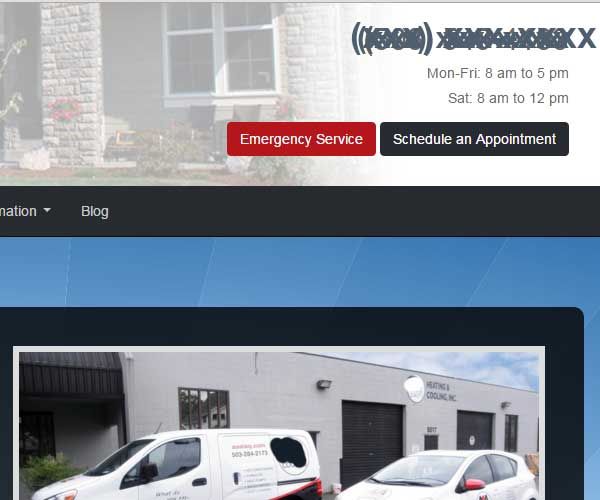
However, when you click it, you are taken to a page that gives information about emergency services. The phone number is clear on this page, but it STILL is not clickable. This means, someone with a true emergency has to take four steps to a directed call after coming to the website – enter website, click ‘Emergency’ button, go to the next page, write down the number and dial it.
Half of these steps could have gotten eliminated by also making the phone number a link, instead of plain text.
Even if a user is not on a mobile devices, this button/link allows for your phone number to be clear and in plain sight. The worst situation is spending thousands of dollars for quality traffic, people eager for your products or services, but not having a fast method of contacting you.
2 – Contact forms with simple requests
Contact forms are used by many, many websites. In the services industries, you will see these just as often as click to call buttons, or links for phone numbers and emails.
However, these are a family of conversion elements. Contact forms are not all the same, and there are no hard and fast rules about the amount of contact forms, placement, etc.
But I will say this, a contact form capturing a lead, a form offering an optin and another form used to complete a shopping cart action should all be different. The goals are all different for these. The information collected is all different.
Because of this fact, we really need to make sure that each contact form is focused on its goal, and does it correctly.
According to Dan Zarrella of HubSpot, conversions rates for their forms improved by almost half by going down from four form fields to three.
Yes, eliminating form fields increases conversions. Removing one or two creates impact. Removing over half can move visitors to some steady action.
Look at the following. Do you see any unnecessary form fields?

Let’s be real here, ok?
If you are doing an intake, or the customer expects a long form, this is fine. However, this form takes up 1400+ pixels, top to bottom. This form is also on the home page. What is the form’s goal? What would your goal be on the homepage?
The home page of your website is meant for speed above all else. People come to convert, or go deeper and find more info.
With this particular form, placing it deeper into the website might be better. Initially, you might want only a name, number and phone number. Possibly, you can do with a name, email and text area box to address their issue.
The point is to get a new customer on the phone…not stuck in a form.
3 – Speed over everything
Speed kills.
On the internet, it is the lifeblood of a good website.
Better speed, means better conversions in the end.
How and why would a faster loading website mean ANYTHING to someone coming to the website?
The answer is 3. Three seconds is life or death for your website.
According to Kiss Metrics, 40% of people abandon a website that takes more than 3 seconds to load. Add on top of this, that “a 1 second delay in page response can result in a 7% reduction in conversions” according to the same study.
The other part of your need for speed involves proving authority, as soon as possible.
You can do this on your website simply by showing badges and icons from authority groups and organizations that your business is a part of. If you, as the owner, are a part of an equally industry-standard and authority group, you should place that badge on your homepage as well.
Every industry has organizations that you can be a part of. You can also promote the fact that you have X amount of 5-star reviews, or that you are A+ rated in an organization.
Placing these badges, buttons and icons on a homepage, as close to the header as possible, means that people are making that “authority” connection as soon as possible.
Finally, what can you do…
Below, you will see a demo layout of a small business website.
I chose a landscaping theme, as I have an interest in landscaping marketing that I’ve been fulfilling. This could be for ANY industry. Landscaping, orthodontics, criminal law, pet sitting, mobile massage…anything!
You will notice social media buttons and a phone number in the header, and a contrasting navigation bar on the left.

Let’s agree here, there are many websites online today that matches this formula and layout.
Even today, while this layout is circa 2001 or so, in 2016, with mobile-centric users, and a fast, clear experience desired, businesses are still in business with the above layout.
And now, welcome the “newness” of a lead generation focus on website design.

In this example above, I have put together a basic layout that promotes lead generation above everything else. Information that would be considered ‘sit-down’ or research is deeper in the website.
The primary goal is to convert. The first goal of a business website is to for lead generation, and information internal on the website.

In the above example, I focused on both calls AND email collection. In fact, this is obvious as the contact form is contrasting in a similar fashion to the phone number in the header.
“But, we don’t see a lot of customers from our business’s website.”
I’ve heard this a lot.
You don’t see many of your customers talking about your website, so it must not be a need for you, right?
The only issue with this is that the people who you could have converted with your website, went to another company for their needs. And, over time, those mobile users, the ones that you don’t think you need to address, will slowly chose the businesses that are ready to address them now, and not after 5 or 6 clicks.
How will you know if your website needs an update?
Take a look at your website, right now. Ask yourself the following, and I hope it is nothing but positive.
Can I easily convert (click, call or contact) on my homepage and internal pages? Based on the look and authority, would I choose myself?
After all, missing out on a lead might not have an immediate impact.
Missing out on a lead a day, could be a killer.